Sunlight isn’t everything
Reminding myself, and maybe you, that a home with low natural light doesn't have to feel dark and drab.
Lisa in Colour is a reader-supported design and interiors newsletter for those who love living with colour and personality. It’s also about things—beautiful, useful, weird, and wonderful objects that tell a story.
Weekly Friday posts are typically for paid subscribers, but this week’s edition is open to all, so curious readers can get a feel for what to expect. Click here to learn more about me, and this column.
When we bought our house—a 100-year-old heritage home with small, of-the-era windows—I told myself it got perfectly fine natural light. We only viewed it once before making an offer. And I was too charmed by the home’s character—original fir floors, an arched front porch doorway, plum-coloured tiles under the fireplace—to notice otherwise. Now that we’ve lived here for four years, I can tell you that on certain grey mornings, when the sun is nowhere and the windows barely seem to try, I find myself yearning for brightness the way some people crave sugar.

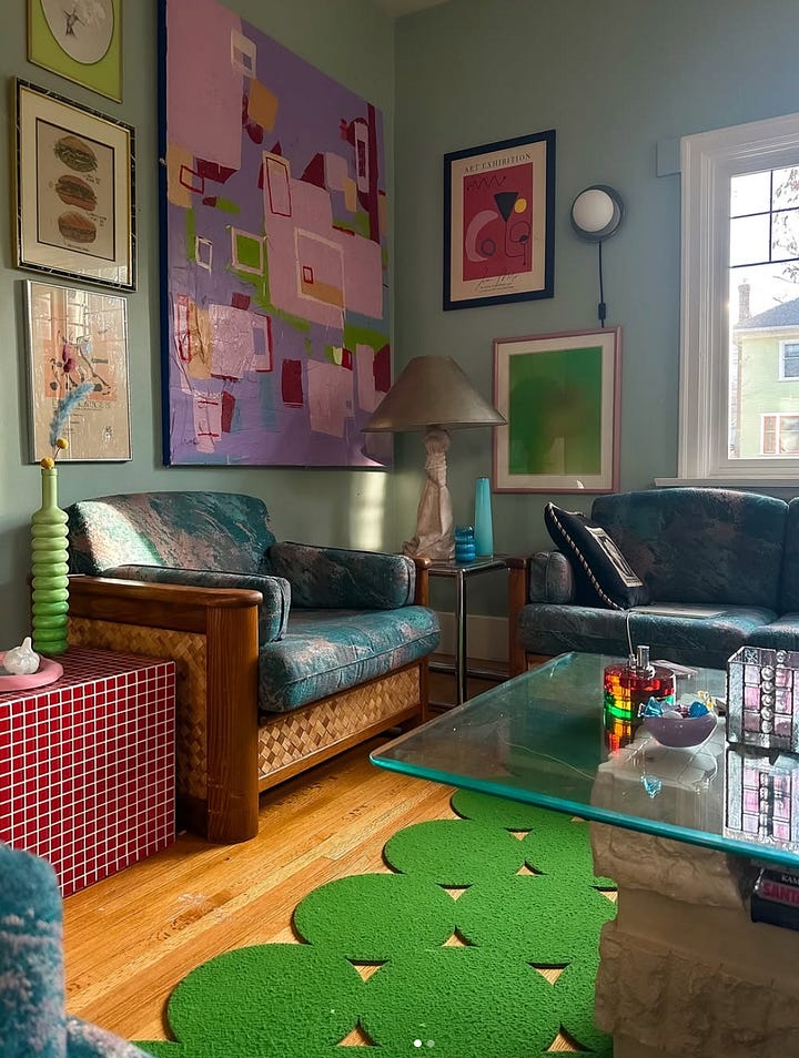
Our home is in the downtown neighbourhood of a 110,000-person city. That means our neighbours are close and trees are mature, soaring well above our roof. It’s a lovely area where each house looks different from the next, but the density means that any sunlight that could squeak through our small, century-old windows is quickly snatched up. Mirrors help. I’ve hung them strategically across from every window that even attempts to glow. They bounce light around like a game being played in slow motion. But eventually, you realize that mirrors only reflect what they’re given. If the input is grey, the output is too.
The last two days as I’ve been working on this column, it’s been sunny. Not a cloud in the sky. So sunny that I’ve actually worn a baseball cap while sitting inside on my couch armed with my laptop. Still, the sunlight only comes through these front windows for a few hours midday, then it’s gone behind one tree after the next until tomorrow.
Because of this, I’ve been thinking about finding joy in low-light rooms. I think it’s less about wishing for bigger sun-soaked windows (which are not in our budget) and more about creating something from within.
For me, it starts with colour.
A few years ago, I painted our fireplace bright bubblegum pink—warm and bold and a little bit impulsive. It casts its own kind of glow, regardless of whether the sun is out or not. It radiates something warm and alive that somehow gives the illusion of natural light. When your home is short on sun, like mine, that feeling counts for a lot.
We know that the rods and cones in our eyes perceive colour differently depending on light levels. There’s something called the Purkinje effect, where warmer colours appear duller in low light, while blues and greens become more visible. Still, even knowing that, I find myself drawn to more fiery shades in dim rooms. My living room is currently a robin’s egg blue, but I am days away from painting it clementine orange. Maybe it’s defiant. Maybe it’s emotional. Maybe it’s just that colour, when used with intention, can create its own mood, its own sort of tempo.
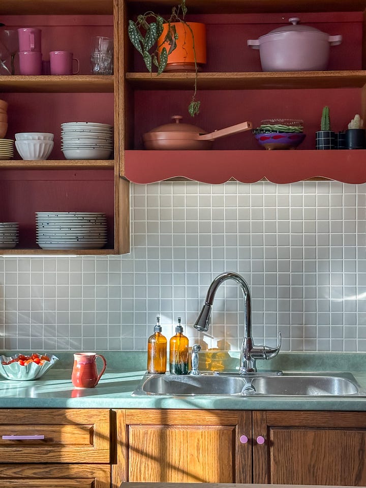
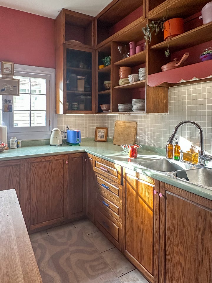
Lighting helps, of course. But not in the Big Light, blue-toned way that makes your home feel like a medical office. I like light that lives at eye level—lamps with fabric shades, wall sconces, even the glow of the under-cabinet lighting in the kitchen (which I pretty much keep on 24/7 for that extra buzz of light). My favourite lighting colours are always the ones that seem to hold a bit of amber inside them, though recently I picked a up few Phillips Hue light bulbs, which change colour, to pinks and oranges and purples, all by using a bluetooth app on your phone and clicking a few buttons. It’s a satisfying way to add a touch of colour and warmth to otherwise cool, light-lacking corners.
Glossy surfaces, like the lacquered edge of a console table, can also catch and reflect whatever light you do have. Metallics do this, too. I once brought home a 1970s tri-lamp with brass frame from the thrift store. It was tarnished and needed a polishing, but it cleaned up well. It currently lives on my mantel and whenever I flick it on the whole corner lights up like a candle has been lit from the inside. That lamp has stayed with me through three different homes.
I still have days where I curse the shadows in this house. Where I dream of skylights or picture myself living in a long, single-storey rancher with floor-to-ceiling windows that lets the sun pour in like water. More often though I remind myself that lightness isn’t just about photons—it’s about feeling. A room can glow without the sun. It can feel like a refuge, or a dream, or a cocoon. And sometimes, that’s even better.
Some things I think about when I’m decorating in my low-light rooms:
Colour choices influence ambiance
Warm colours, like orange, combine the energy of red and the happiness of yellow, promoting feelings of warmth, enthusiasm. Orange has always been a favourite of mine and it works especially well in low-lit social spaces like living rooms and kitchens.
Amplify the light you have
Mirrors and glossy finishes: Positioning mirrors opposite windows or light sources can double the perceived light in a room. Similarly, glossy or satin finishes on walls and furniture can reflect light, too, making spaces feel more open.
Create a cozy glow with lighting
Avoiding harsh overhead lights: Lots of homeowners prefer to skip The Big Light, opting instead for layered lighting solutions with lamps that create a warm and inviting atmosphere.
Lighting strategies: Incorporate a mix of ambient, task, and accent lighting. Use floor lamps, table lamps, and wall sconces to distribute light evenly and create depth.
Add depth and warmth
Soft furnishings: Incorporate plush rugs, velvet cushions, or woven throws to add warmth and comfort to dark spaces.
Metallic accents: Use metallics like brass or chrome in decor pieces to reflect light.
As I was putting this together, I came across some helpful reads. I’ll leave these resources below, incase you’re curious to do some additional reading.
Further reading and resources
Colour Psychology: Colour Psychology: Using Orange in Interiors
Lighting Tips: 13 Ways to Fake Natural Light
Scientific Insights: Thresholds and Noise Limitations of Colour Vision in Dim Light
The Colour List: May 2, 2025
The Colour List is a weekly round-up of art, design, and home objects that caught my eye—things that felt joyful, thoughtful, or just plain beautiful enough to pause and look twice.
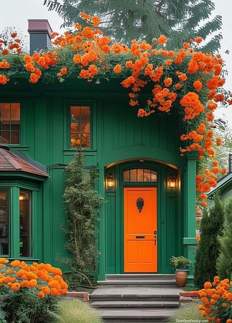
The fist thing on my mind this week: marigolds. Hear me out. Marigolds always take me back to the '90s—planted in tidy rows along driveways, their bold orange and yellow heads bobbing in the breeze. Sometimes my brother and I would pinch the petals off to make potions. I think there’s something sort of unapologetically cool about them, when piled together. More is more for marigolds. Our local Costco has them on sale right now and I’m seriously tempted to buy a dozen, all orange.
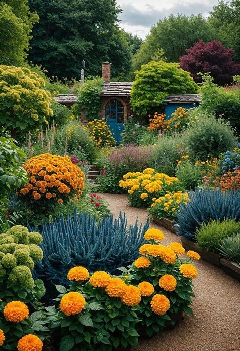
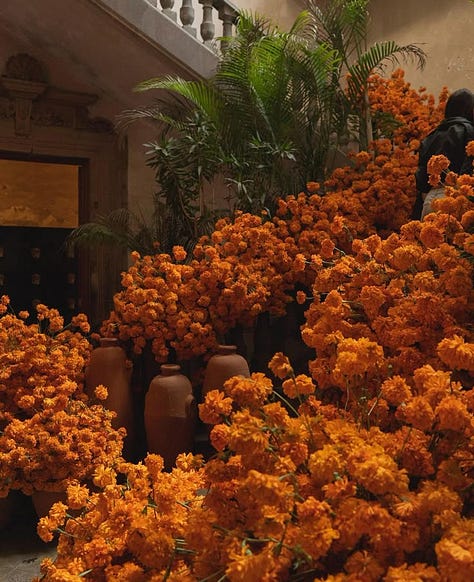
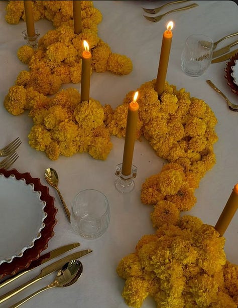


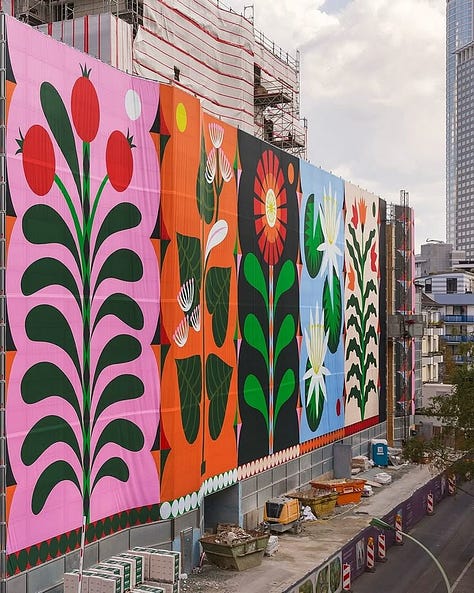
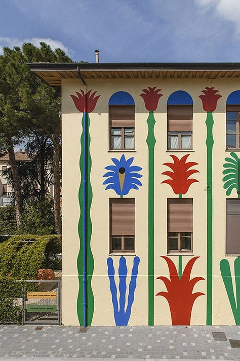
On the note of gardens and outdoor spaces, I’ve been saving a lot of colourful mural inspiration to Pinterest. We have an old shed in our backyard and I think this is the spring that it gets a facelift. I’m drawn to these abstract floral motifs. Surely I could take inspo from some of these and make our sad shed look a little more cheerful. Right?
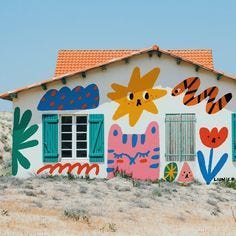
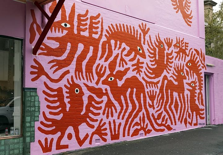
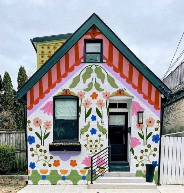
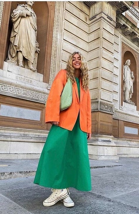
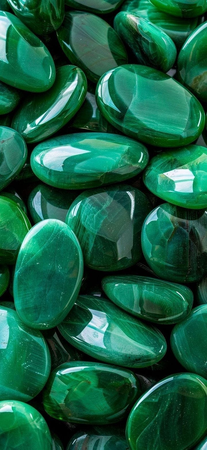
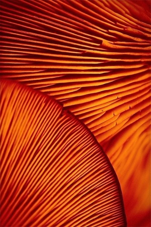
I posted this colour combo ‘orange + teal-ish green’ to Notes last week and it blew up! I can’t believe how triggering calling this colour “teal-ish green” was for some people. I actually spoke with the executive director at Pantone last week for a separate story I’m working on and she explained that teal has so many shades—some lean more green and others more blue—including, surprise surprise, teal green. To be fair, I do think the fashion image is much more emerald than teal green.

What are you currently thinking about when it comes to your space? Are you mulling over patio ideas or considering planting a garden? I’d love to hear what kind of projects you’re thinking about or already have on the go.
Thank you for being here,
Lisa
Lisa in Colour is a reader-supported design and interiors newsletter for those who love living with colour and personality. It’s also about things—beautiful, useful, weird, and wonderful objects that tell a story. This Friday post that you just read is typically for paid subscribers, but this week’s edition is open to all, so curious readers can get a feel for what to expect.
Click here to learn more about me, and this column.


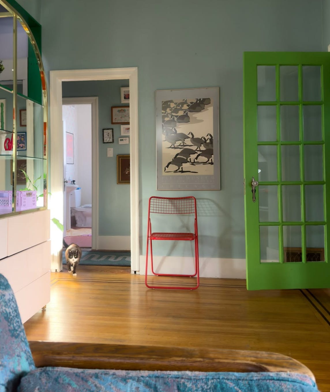

I always find my home feels brighter and bigger after a good cleaning!