


Why does “sage” sound more attractive than “light green”?
A look at how colour names influence perception, from paint chips to nail polish.

A quick housekeeping note before we dive in this week… I’m experimenting with a twice-a-month schedule for Lisa in Colour to make space for more thoughtful stories (and maybe fewer typos). What do you think—do you prefer this pace, or miss the weekly rhythm? I’d love your feedback.
A couple weeks ago, I published a piece about how the English language falls short when it comes to describing colour. I was so moved by the responses. So many of you wrote me with your own thoughts and experiences. That feedback shaped this week’s column, which continues in the same spirit: a closer look at the names we give to colour (in English, at least), and what that does.
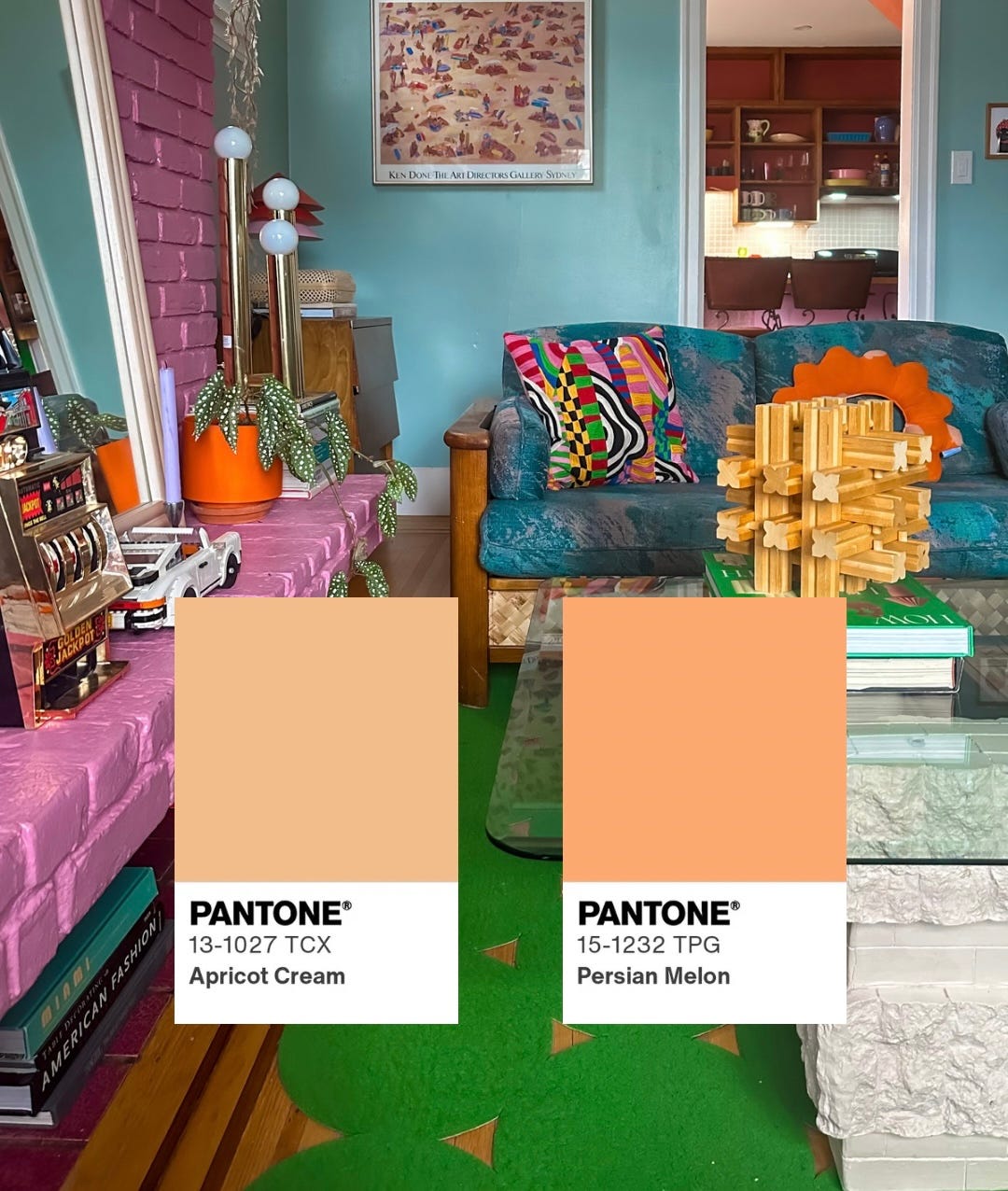
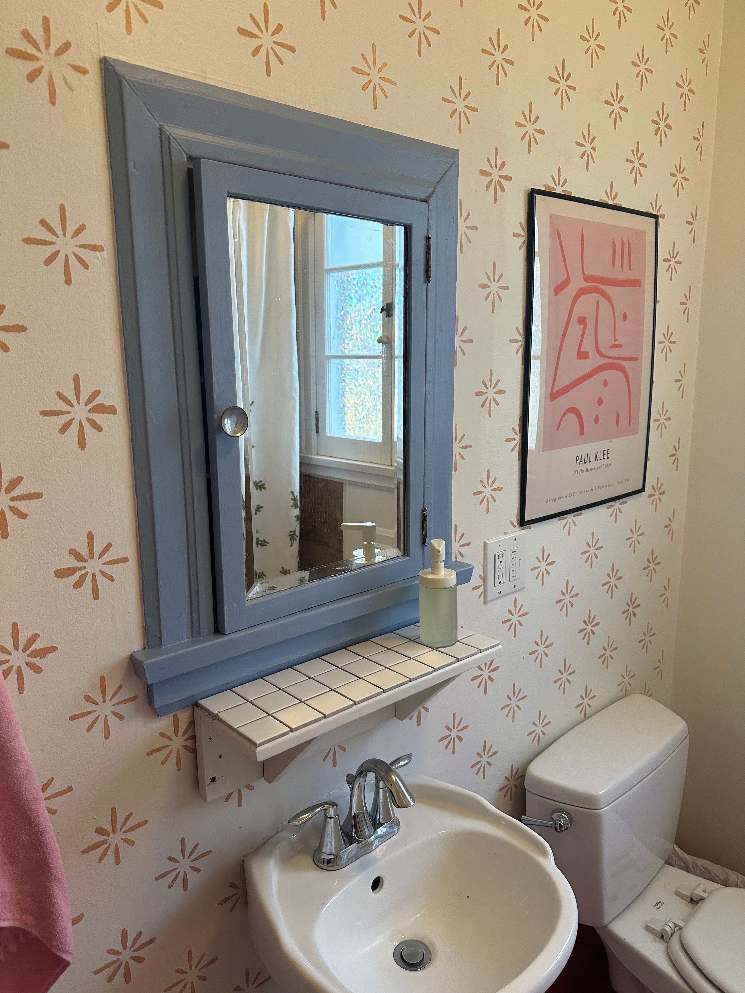
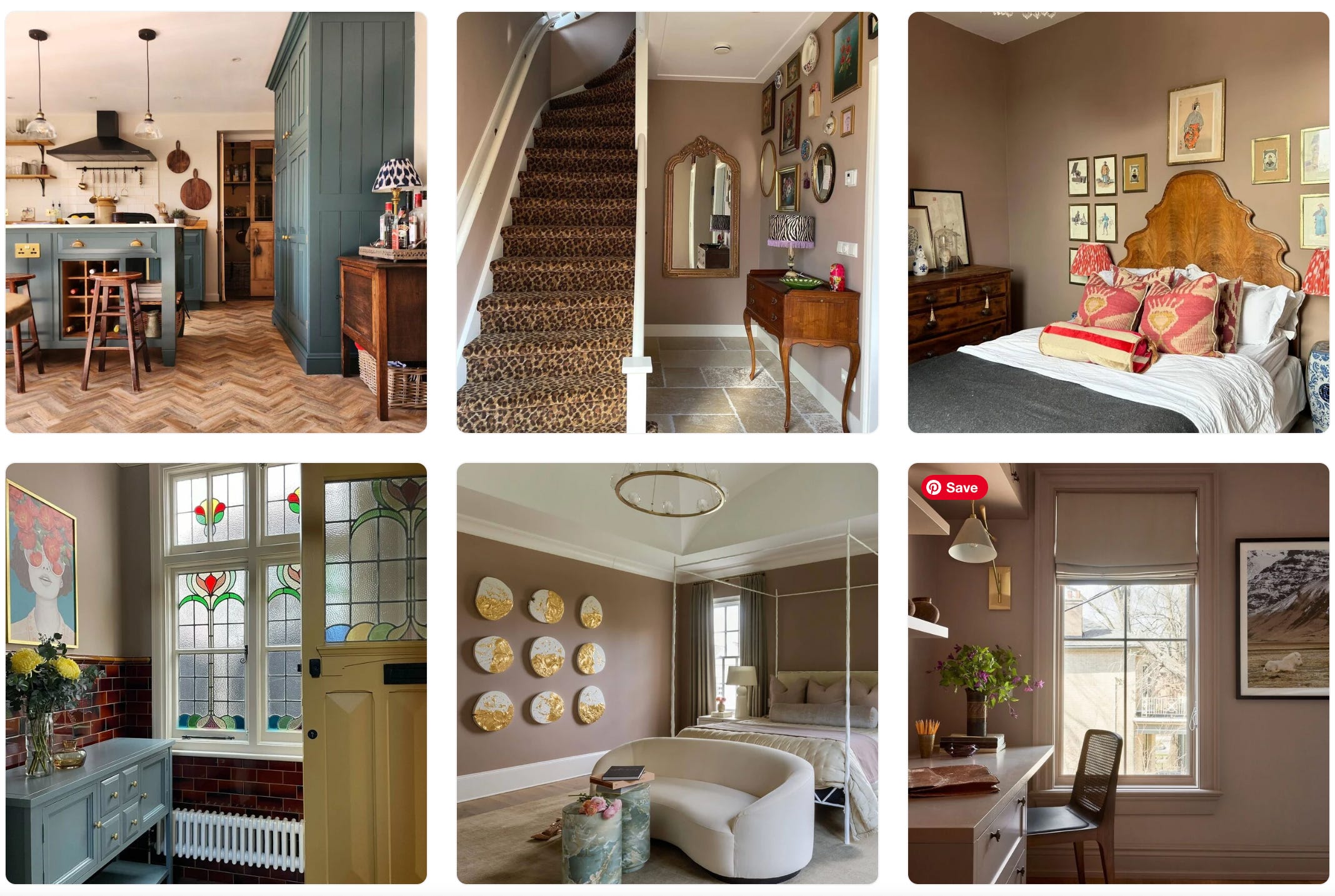
It’s something I’ve been thinking about again lately—mostly because I’ve been painting. Most recently, the trim around our main floor bathroom mirror. (It’s a built-in with a medicine cabinet hidden behind the mirror that’s framed in the original trim). I chose a creamsicle-ish hue—one of the orange test paints that I’ve been thinking about using in my living room.
Like always, I got stuck on the names. Not the colour codes or formulas—but the names of the paint. It seems ridiculous, I know. But they’re designed to make you feel something. To sell you not just the paint, but the person you might become if you use it.
Would I like this orange as much if it weren’t called Apricot Cream? Even something as familiar as “sage” feels more desirable than “light green.” There’s a kind of emotional shortcut built into the name. One that makes you imagine an entire mood or room or version of yourself before the first coat even dries.
It’s marketing, for sure. I also think it’s strangely powerful.
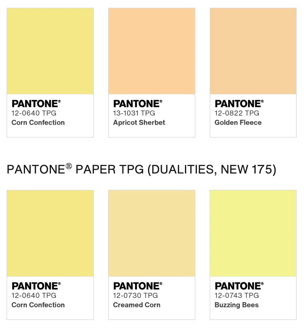
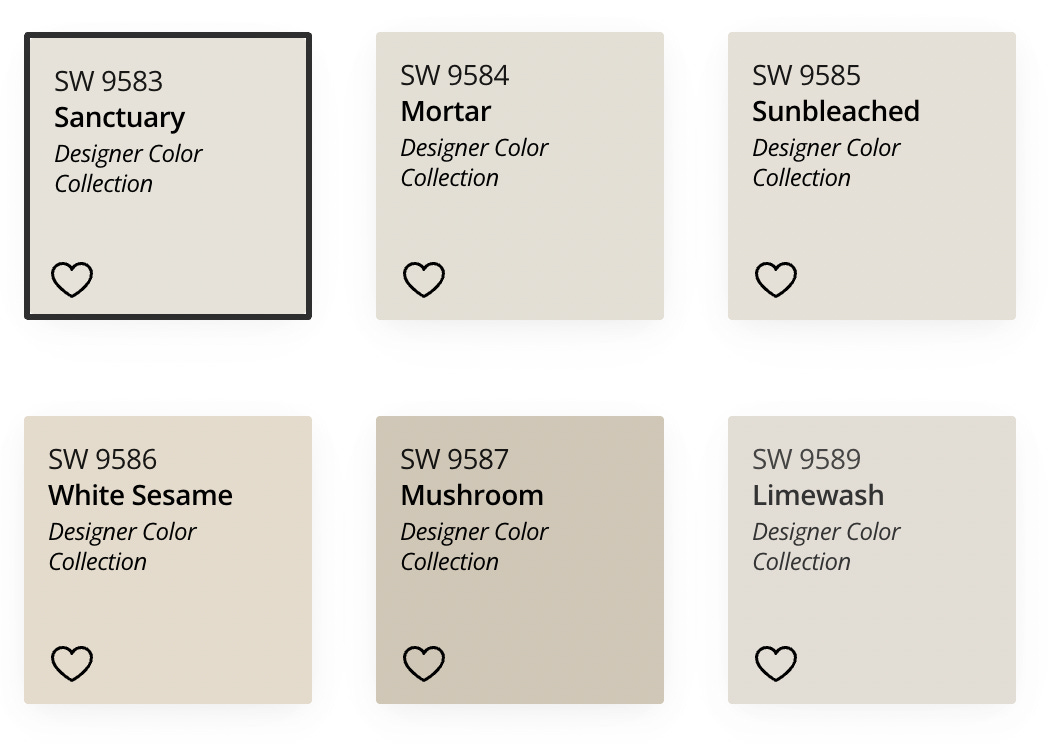
Most of us don’t remember hex codes. (Though I do have #FF1CAE and #FF7F00 forever memorized because I used them so frequently in the 2000s when I designed and coded my own websites.) Most of us, however, do remember that one soft cream called Sunbleached or Sanctuary. Both are real names for various creams from Sherwin-Williams.
We remember how they made us feel—curious, slightly amused, calm. Like yes, this is the right shade. Not because it matched the tiles or worked with the light, but because it said something. It was a whisper of good taste.
The whole practice of naming colours in an evocative way—paint names especially—didn’t really start until the mid-20th century. Before that, it was all practical: “light beige” or “brick red.” Benjamin Moore and Sherwin-Williams were among the first to start experimenting with lifestyle-driven names in the ’60s and ’70s, but it was brands like Britain’s Farrow & Ball that really turned it into an art form. “Elephant’s Breath,” “Skimming Stone.” You’re buying into a feeling, not just a colour. (Though I would argue that I don’t think an elephant’s breath would smell particularly good.)


I also think colour names can have the opposite effect. Farrow & Ball has another hue called “Dead Salmon.” Not “Cooked Salmon” or “BBQ Salmon.” Dead. Salmon. It doesn’t sound apealling to me. Quirky, yes, but I’d be more likely to choose it if it has a softer, prettier name.
In the 1960s, two anthropologists, Berlin and Kay, studied how languages around the world categorize colour. What they found is that cultures tend to adopt colour words in the same general order: black and white first, then red, green or yellow, and so on. Some languages don’t split blue from green at all. Not because people can’t see the difference, but because the language hasn’t built it in. How we describe colour is cultural. And flexible.

Even in English, “taupe” could mean a dozen different things depending on who you ask.
It’s not just paint. Nail polish brands figured this out a long time ago, too. OPI basically built its whole brand on clever naming. Colours like “Lincoln Park After Dark” and “You Don’t Know Jacques” don’t tell you anything about what the shade looks like. They do, however, tell you who you might become while wearing it.


For me, it was MAC Cosmetics.
I had this nail polish when I was 13 called “Silver Surfer.” It was a metallic chrome that my uncle—who worked in IT at MAC at the time—gave me. I was obsessed with it. It felt more interesting than anything I could buy at the drugstore. I liked the way it looked, but I think I liked the name even more. I was just starting to use the internet back then, and I named my first Angelfire website after it. Silver Surfer. I don’t remember what I put on the site—probably song lyrics and grainy webcam selfies—but I remember how that name made me feel. So cool.
I can’t find any evidence of Silver Surfer when I search for it, but I did find my second favourite shade from that era: Tilt. It was this blue-ish metallic.
 RARE & DISCONTINUED - Picture 1 of 2")
The thing about names is that the stick in our minds. They shape how we remember colour, how we talk about it, how we use it. Even if the colour is just… pink.
Sometimes I wonder if we’ve given up our own language for describing colour in favour of brand-approved ones. I still make up random names for colours without realizing it. This week I saw the prettiest warm brown mohair cardigan at a thrift store and thought to myself, “toast left too long in the toaster.” It’s not an elegant name—and probably why I don’t have a job naming paint swatches—but it worked.


The purple I picked for our exterior trim is called Mature Grape and I smile every time I tell people that. Not because it’s a particularly beautiful name. But because it’s so specific, you can visualize the jiggle of a ripe grape ready to be plucked from a vine the moment you say it. Because it makes the colour feel like a story.
And colour and decor, if nothing else, is always a little bit about storytelling.
Thanks for being here!
Lisa
I know what you mean. Our living room paint colour was called French vanilla and I love it, but it was renamed papaya. Although I love eating papaya, I didn’t love saying that was the colour we had chosen for our living room. So I still think of it as, and call it, French vanilla.