


Is there such thing as a bad colour combo?
How we perceive colour is shaped by individual brain wiring and context, so what looks wrong to one person might work for another. Plus, practical ways to experiment with different colour pairings.

I’ve always been into colour pairings. Back in the early ’00s, when I first started coding and designing my own website (it was a digital journal back then, sort of like a blog today), I’d spend hours tweaking the layouts in Photoshop—obsessing over which colours matched, and which clashed in that so-bad-it’s-good kind of way. One of my favourites was electric pink with banana yellow accents. I was 15 years old, don’t judge me. (I tried using the Internet Archive’s Wayback Machine—that digital archive that lets you view how websites looked at different points in time—to screen cap some of my old sites for reference. Sadly, none of the main graphics I’d designed are saved—though the text is—and, to be honest, it makes me cringe to read my old entries!)
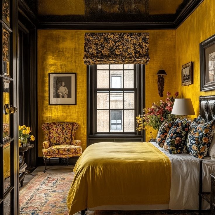
After moving out for university, I found myself living in the attic apartment of my friend’s grandparents’ house in Chinatown. We only had a hotplate and I ate a lot of instant mashed potatoes back then. I was allowed to paint the bedroom walls when I moved in, and so I opted for the brightest yellow known to mankind. The ceiling was black. I thought this combo was so edgy. When I look back at photos of this room, it’s somehow both neon and muddy. I can’t imagine sleeping in a room with those colours now, but at the time, I liked it.
And so the question lingers: is there really such a thing as a bad colour combination?
On paper, yes. Some pairings do clash. They can feel jarring, overstimulating, or just plain confusing to the eye. From a design standpoint, these are often combinations that sit too close in value but far apart in hue, or that compete for visual dominance. In colour theory, this is often explained through concepts like simultaneous contrast and visual vibration—a phenomenon where colours placed side by side seem to buzz or blur, especially at full saturation. Here’s a breakdown of simultaneous contrast from the Interaction Design Foundation that I find really helpful.


I think there’s a twist when it comes to colour and interiors: context is everything.
What looks chaotic in a living room might feel electric on a dance floor. My black and yellow university bedroom could’ve been a cool concept for a coffee shop. Some of the boldest, most rule-breaking palettes have made their way into history books—just look at Memphis Milano design in the 1980s, with its unapologetic mashup of teals, pinks, blacks, and yellows.
Sometimes the so-called bad combinations are the ones that grab your attention and stick in your memory. Or surprise you with their audacity.


I think about this a lot when I look at vintage dishware or old ads, even. The 1970s were wild for colour—mustard yellow, rust orange and brown all mingling on the same plate. And somehow, it works. Maybe not in the minimalist, mood board sense of today, but nostalgically? It’s iconic. A quick scroll through Pinterest for 1970s ads and you’ll see what I mean.
Even in my own home, I’ve seen this in action. I hesitated to paint my fireplace bubblegum pink because the walls in the living room were a dusty blue. On their own, I don’t think these colours are the best fit, but when framed by the white trim and warm wood floor? Perfection.
I think that’s the thing: colour is rarely absolute. WIRED published this piece about our perception of colour and how it goes beyond wavelengths. Colour combinations are shaped by context and memory. So, what looks “off” to you might feel nostalgic or exciting to me. I think that rings true. When I was building websites in the late ’90s, I wasn’t just picking colours that matched—I was creating moods, even if the combos were objectively a little weird and were based on my rollercoaster of teenager emotions.
Keep reading with a 7-day free trial
Subscribe to Lisa in Colour to keep reading this post and get 7 days of free access to the full post archives.