


Colours we inherit: How memory shapes our colour taste
The colours you lived with as a kid show up in weird ways in adulthood; plus: colourful outdoor furniture that's caught my eye, a joyful coffee maker collab, and patterns in food.

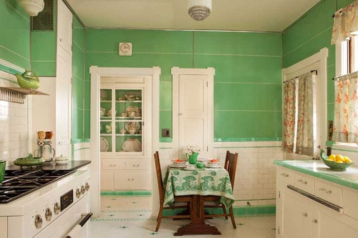
Growing up, our kitchen was soft green. Somewhere between artichoke and a wooly lambs ear plant. My dad handmade stained glass panels for the cabinet doors, which complemented the room’s green glow. Our cutlery set had green resin handles. The dish ware? It was a grid pattern with greens, blues and taupes. I didn’t think much about this back then. I was a kid. It’s just how it was. But now? Now I find myself mindlessly hunting for the perfect version of that shade of green.
We like to think we choose our favourite colours with our own free will. These hues that stay with us throughout life are pinned to our memories like a prize ribbon. Creamsicle orange is so me. So often, however, I think that the colours we’re drawn to are echoes of something from our past. They’re stitched into our subconscious.
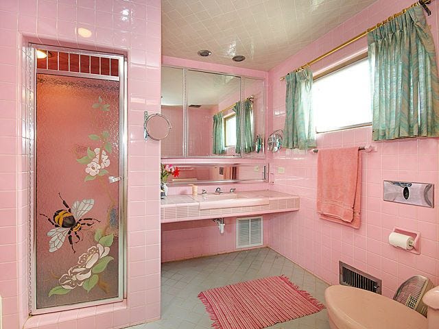
Maybe that’s why I feel a sense of comfort around burgundy and pink. My grandma’s house was peppered with burgundy and pink accents. Tablecloths, crochet Kleenex box holders, artwork painted by her friends. Her couch had faded flowers in these colours. Even when she downsized (I use that term lightly—like me, a fellow Taurus, she loved her stuff, right until the end) into an apartment, her burgundy and pink treasures followed. I can see her smile and hear her laugh when I happen upon a space with these accent colours.
Some colours aren’t just about nostalgia. There’s real research behind it: colour memory is powerful. A 2001 study in the Journal of Experimental Psychology found that people have remarkably strong memories for specific shades of colour, even years later. These aren’t just colours—they’re coordinates of our personal timelines. It’s why those burgundy and pink hues make me feel. Designers have long known that colour can trigger emotions and associations, too, whether we like it or not.


Colour taste, like everything else, is also shaped by context and trends. Think about the browns and oranges of the 1970s. The peaches of the 1980s arrived with optimism. In the 1990s, forest green dominated kitchens and living rooms, and by the 2000s “builder beige” became the backdrop for a kind of suburban minimalism that prioritized neutrality above all else.


These colours become signifiers. They tether us to a moment in time. And so, our preferences don’t simply emerge out of nowhere.
They’re reactive. Shaped by what we grew up with, what pop culture told us was stylish. Sometimes we might reject a colour simply because it reminds us of a hallway we walked down every day in high school. Sometimes we don’t realize we love a shade until we see again in adulthood.
I have fleeting memories from the ’90s of puffy floral valences hung at one of my aunt and uncle’s houses. The living room itself was ivory with over-stuffed furniture and good natural light. But it’s those floral valences in pinks, corals and greens, that are marked in my mind.
The colour of my parents’ bedroom, always some shade of cornflower blue, will forever be nostalgic. There’s comfort in that soft and quietly cheerful hue.


What are colours that are nostalgic from your childhood? Maybe you’ve never taken the time to think about it. I really hadn’t put much thought into it until I was working on this column. It’s funny to see what comes up. Truthfully, a lot of the memories are fuzzy for me. It’s more of a feeling than a crisp visual of family decor from decades past.
Still, there’s something to be said about holding on to these snippets. Maybe that’s the strange gift of inherited colour: it shows us where we’ve been and what we’re still carrying. It lives in the margins of our memories, softening over time, until one day you find yourself painting your kitchen the exact shade you once swore you’d never live with again.
The Colour List: April 11, 2025
Spring is here in the Interior of British Columbia. (I’m currently sitting in a sun patch on my couch as I write. It’s where I work from most days.) A few bags of bulbs—mostly hostas—are ready to go into the ground in my garden this weekend. There are sunflower seeds, too. I’ve started pulling out my patio furniture from the shed and it all could use a good scrub. I feel like my colourful style is harder to transition outdoors. There are fewer options for cheerful patio furniture in general. Still, I’ve been compiling a list this year.
Fatboy, a Quebec-based company, has some playful outdoor options. This bubblegum pink stool/table is made of polyethylene and can be filled with water or sand to make it sturdier. I like it’s shape.


Fatboy and Dusen Dusen launched a summer collab this week. The collection has some amazing pieces, like this XXL two-seater. If I had a budget of infinity dollars, I’d get a few of these:

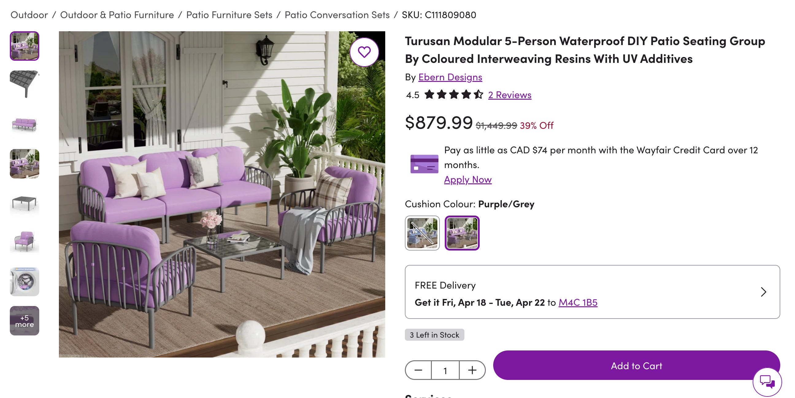
Personally, I prefer something more lounge-y for my outdoor seating (see above) than this option below. But the bright lilac pillows might convince me otherwise. It’s so charming!
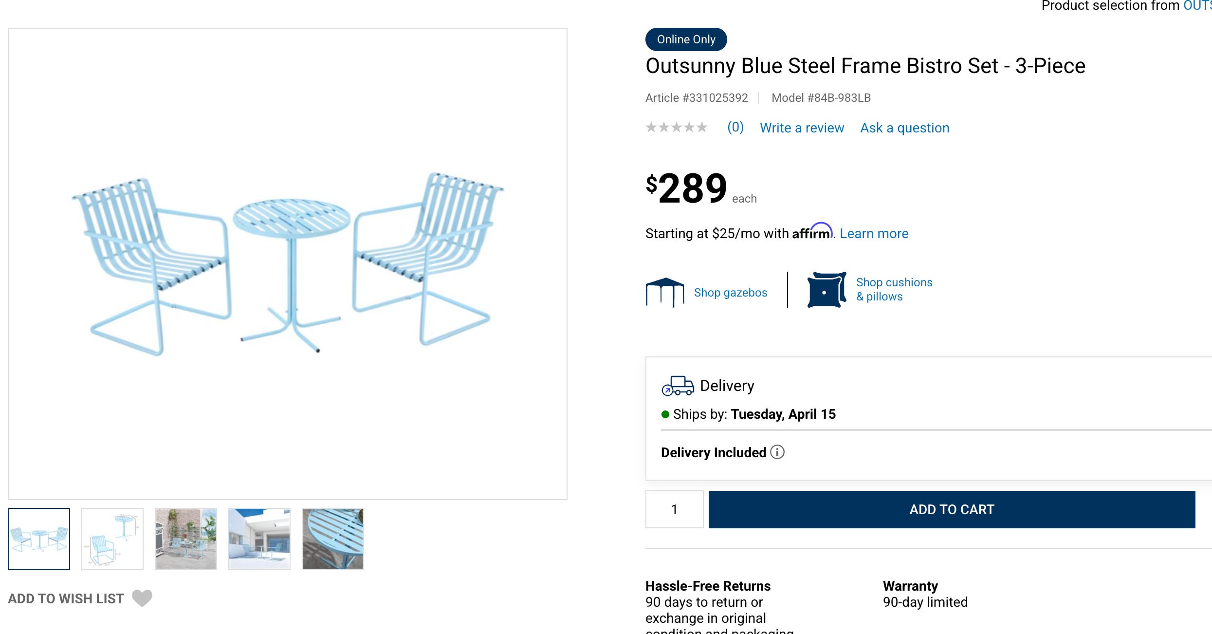
Even a mainstream shops like Rona are getting more bold with colour. This baby blue table set is quite sweet for a small space.
I stopped drinking coffee recently, but that doesn’t mean I’m not keeping an eye on aesthetically pleasing small kitchen appliances. Look at this latest from MoMA Design Store and Bodum. I have the toaster from the collab and it brings me joy every morning.


For my grand finale of things that brought me joy this week: patterned food presentation. I’m going to a The White Lotus themed party this weekend. My contribution will be a watermelon salad. Usually I chop everything up (watermelon, mint, feta) without much thought, but maybe I should cube it all this time.


Thank you for being here,
Lisa